SuiteAnalytics Workbooks in NetSuite: A Complete Guide to Dashboard Reporting
Most NetSuite dashboards are built with saved searches. It is the default approach and it works well enough, until it does not.
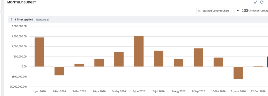
There are two problems that come up repeatedly. The first is the limit on number of saved searches that can be selected in dashboard. Once you hit it, you cannot create new ones without deleting old ones, which means your dashboard options are constrained by what already exists in the account. The second problem is that saved searches do not expose every field on every record type. The budget record is a good example. You cannot filter budget data by month in a saved search. If you need a monthly budget view on your dashboard, a saved search simply cannot give it to you.
SuiteAnalytics Workbooks solve both of these problems. They sit outside the saved search limit entirely, and they expose record fields and filtering options that saved searches do not. If you have been working around saved search limitations with workarounds and approximations, workbooks are worth knowing properly.
Here is how to build a dashboard using one.
Step 1 : Create a Dataset
Go to Analytics, then Datasets, then New. Select the record type you want to report on —> Transaction, Budget, Item, or whatever fits your use case. From here you choose which columns to include, set your filters, and define any groupings you need. This is where the power difference shows up. For budget data for example, you can filter by accounting period month directly, which a saved search cannot do.
Think of the dataset as your data layer. It defines what data is available and how it is shaped before any visualisation happens.
Step 2 : Create a Workbook
Go to Analytics, then Workbooks, then New. Select the dataset you just created as the source. From here you configure how the data is displayed —> as a table, a pivot, or a chart. You can set up multiple views within the same workbook, so one workbook can have both a chart and a detailed table side by side.
The chart options include bar, line, area, pie, and donut. For financial reporting, bar and line tend to be the most useful. For a budget versus actual comparison, a grouped bar chart with months on the axis gives you a clean view that would take significant formula work to replicate in a saved search.
Step 3 : Add to your Dashboard
Once the workbook is saved, go to your Home dashboard or whichever dashboard you want to update. Click Personalize Dashboard, then Add Content, and look for the Workbook option. Select the workbook you created and it renders directly in the dashboard.
The workbook is interactive. Users can click into the data, change filters, and explore without leaving the dashboard.
When to use Workbooks over Saved Searches
Saved searches are still the right tool for transaction-level lists, alert-style portlets, and anything that needs to feed into other NS functionality like workflow criteria or email templates. Workbooks are the right tool when you need aggregated reporting, pivot views, charts, or access to record fields that saved searches do not expose.
If your account is approaching the saved search limit, migrating your dashboard portlets to workbooks is also a practical way to free up capacity without losing visibility.